

Capture the gesture, not the paper
The most useful handwriting conversion starts with dark, readable ink on a clean, evenly lit background. The task is to preserve the rhythm of the writing while excluding ruled paper, shadows, camera noise and accidental texture that would only become extra paths.
A vector result is especially useful for a sign, keepsake, decal concept or printed design where the writing needs to scale. It is less useful when the exact grain, pressure and irregularity of the original pen stroke are the whole point of the piece.
Set up the source for a cleaner result
Use flat, even light and keep the camera directly above the page. If possible, scan the writing; if you photograph it, crop tightly and correct obvious perspective before conversion.
- Use dark ink on a plain, light background.
- Avoid lined paper, hard shadows and folded or textured surfaces.
- Leave enough margin around tall ascenders and looping descenders.
- Save the original scan or photo before simplifying the result.
Check line weight at the final physical size
What looks elegant on a large monitor can close up or disappear on a small label. Preview the converted lettering at the actual width of the sign, gift, sticker or print, then simplify fragile details before production.
For a cutting, engraving or print workflow, confirm the provider’s requirements before exporting. The converted artwork helps communicate the intended mark; the final production file still needs the right format and a real-size proof.
See the conversion direction before you prepare the final file
A strong source image can be simplified into clear, high-contrast artwork. Treat the converted result as a production starting point: inspect it at the final size, then confirm the format and detail requirements with the next tool or vendor.
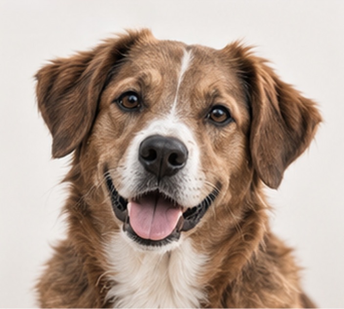
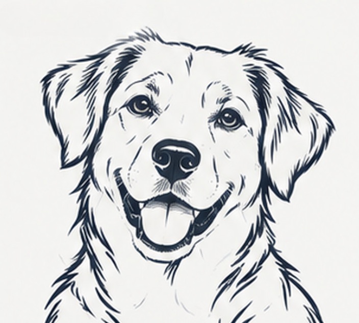
Example artwork illustrates a possible conversion direction. Detail, line weight and suitability depend on the source image and the intended workflow.
Production check before handoff
For an item that will be cut, engraved or printed small, test the thinnest stroke and tightest loop first. The vendor’s production proof is the final check.
Convert an image- Clean lighting and a plain background help preserve the writing rather than the paper texture.
- Handwriting vectorization is strongest when the final goal is clear, scalable line artwork.
- Always inspect small loops, counters and thin strokes at the final physical size.